Friday, December 14, 2007

Fin.


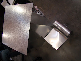
Alas, the time capsule project has come to a close. It has been a challenging, yet rewarding experience, from which I have gained priceless information about design process. This project, which began at the halfway point of our first semester, required us to explore the challenges of group work, rendering, and even the relationship of materials to construction. With such a large project, we were forced to buckle down and organize our process through Partis, sketch models, scale models, detail models, and finally a full scale model. Never have I found myself so frustrated, but there too I have never felt so accomplished. Each and every student found themselves exceeding what they once believed to be their limits, allowing each of us the opportunity to learn more about our abilities as designers. The final design of my time capsule was to be made of 24 gauge galvanized steel boxes to mimic the exposed duct work of the design studio. It was to include 16 boxes, each of which contained 3 compartments to hold sketches of each student. It was to be located in the lobby of the Studio Arts building, allowing the exposed ducts, signature to the IARC studio, to filter down into other parts of the building. The idea was that the structure would appear to have a domino affect, symbolic of our dependence on collaboration within our first year studio. Though my time capsule offered a plethora of hardships, I am quite pleased with the final product and truly appreciate everything it has taught me.

Expert Review

Campion Platt
This designer's use of organic shapes and clean lines create comfortable, refreshing spaces. He uses texture and materials to add to small spaces, making his designs personal, yet easy to relate to. Lighting in the spaces is well incorporated into the designs, making for fantastic contrast within th space. Storage and practicality make his spaces incredible sensible.

Dean Marchetto
The modern lines and shapes of this green designer's spaces are intense, but easy to relax into. Although contemporary, his designs achieve a level of comfort that invites visitors to explore the artistic characteristics of his homes.

Stephen Knollenberg
Beautiful designs. His intelligent blend of clean lines with traditional concepts forms a comfortable, aesthetically pleasing space. His use of unconventional contrast in spaces is stunning, but used carefully to prevent it from becoming overwhelming.

Jaques Grange
I would best describe spaces designed by Jaques Grange as tasteful eclectic. He does a great job of carefully blending international flavors and textures to produce a warm,worldly feel.

David Harvey
This designer has excellent concepts, but uses materials that are too strong from the spaces. They become overbearing and uncomfortable. I love his use of color and art in his rooms.

Monday, December 10, 2007

Professional Pros and Cons

Hiller Architectural Firm- I was blown away by the quality of this website’s design. It was certainly an inspiring, entertaining experience. The site was extremely user friendly, even fun to navigate. The designer utilized white space and color, which allows the eye to travel smoothly across the pages.

Ewing Cole- This site has a very clear layout and excellent use of pattern and color. This site was also very entertaining and immediately grabbed my attention. A changing series of pictures keeps the main page fresh and exciting, while the remainder of the site is straightforward and pleasurable to explore.

Skidmore, Owings, and Merrill LLP- This website features amazing designs which are well presented through a clear, concise layout. The information on the site is comfortably divided into list-like sections following a series of balanced datums.

Opus Group- This was an extremely uncomfortable experience. The small font was accompanied by fast moving photo slides, which made it very difficult to find the focus of the site. The cold blue color scheme boasted little emphasis of any one section the page, forcing it to feel unbalanced and uneasy.

LS3P- This site features a beautiful intro page, but is unclear as to how to actually enter the site. Once past the small text “enter LS3P,” the site is rather cold and corporate. Even so, the site had a tremendously successful layout with interesting lines. The pictures and text were apparent, but somewhat washed out- a negative stylistic choice, in my opinion.

Karlsberger- I was quite impressed with the layout of this site, as it was clear and concise. The pages included text, small pictures, and a large picture, as well as navigation info at to top. Considering the amount of information on each page, they chose successful layouts. The site may have been more successful with less information on each page.

Pei Cobb Freed & Partners Architects LLP- This is a very successful, professional firm, so I would be fitting that such qualities be brought into their website design. As a whole, the site utilizes a very plain font and weak colors. I find that the site speaks poorly of the firm.

Gensler- This website caught my attention immediately. Their use of clear datums ensured clear organization, making it easy to follow. The images on the first page included a largely white room, which was then carried into the text. This flow served to direct the eye across the page. Because the contents of this site was grouped into lists along the side, the website was very pleasant to read.

Perkins + Will- The alternating images and clear labels on this website were incredibly fascinating. The four focuses of the website- Vision, Expertise, Design Solutions, Sustainability immediately show the viewer how to navigate the website.

Callison- Although I really appreciated the designs pictured on their website, Callison immediately struck me as cold and corporate. Because of the cold colors and commercial appearance, I felt very detached from the designs and could not relate to the firm. Despite their stunning designs, I found myself at a loss of interest.

Global Revolution

Diagnostic and Treatment Center, Daimiel, Ciudad Real
Considering the purpose of this building, I feel that it is unbearable cold and industrial. In appearance it is uncomfortable, which seems perhaps unnecessary if not overwhelming for a Diagnostic and Treatment Center. Purpose aside, this building is very abstract is successful in its interesting use of materials.

Filter Perk Parking Garage, Chicago
This parking garage is transparent, designed to span the entirety of the Kennedy expressway. This seems like a brilliant way to eliminate the problem of concrete parking decks, but I am curious to learn what material they could construct such a structure from. The deck itself will have a “filtering” urban garden, but it would be interesting to see if they could use a sustainable material for the massive structure. The use of color could also bring life to this interesting structure.

Architectural Review, 12/07

Leaps and Bounds

Architects and critics such as Chuck Hoberman and Martin Pawley have envisioned a new strain of sustainable buildings. Hoberman has developed a new technology that will allow construction cubes made operable anodized-aluminum extrusions with the ability to expand in a gridded structure. These will allow limited air and sunlight to enter the cubes, but can be retracted to open the space up to light and air.

Similar to the lenses of sunglasses, Laboratories across the country are in the process of developing photochromic windows to increase energy efficiency of buildings. These windows are constructed of “Smart Glass,” which utilizes light and heat sensitive thermochromic glazing to eliminate the need for electricity. Additional research involving mirrors could improve energy performance to the point of reflecting both visible and infared light.

Architectural Review, Dec 2007

Cultural Identity

Archithese (German): After reviewing several editions of this journal, I was very impressed with the apparent flexibility within the solid identity of German design. Clean lines and thoughtful lighting and materials enable German architecture to cross from industrial to beautiful. Steel, glass, and concrete are paired with intense hues to produce a hypnotizing rhythm, intelligently used to unite a space. The industrial feel behind German design is a clear reflection of their history, reminiscent of their not so distant industrial era. The design portrayed in these Archithese journals is enticing, leaving me with a desire to learn more.

Abitare (Italian): Thus far, I have learned little about the existence of cultural identity within design, but I felt a strong presence as I opened the pages of Abitare. Unlike german design, Italian designers seem to play off of color and texture more than materials. Here, too, I saw clean lines and the use of steel and concrete, but the industrial feel was overwhelmed by the contemporary design of the space. For example, a solid white room with stainless steel accents was drawn into the realm of contemporary with its use of playful shadows and faint imprints of trees in the white walls. Although I never felt cozy, I certainly felt artistically inspired.

Graphis (Swiss): Perhaps the best way to describe the design I experienced in the Swiss joural, Graphis, is contemporary artistic. I saw the industrial materials and definite lines, characteristic of German design, but there was a very artistic feeling clinging to such design. Detached from the design itself was a heavy layer of modern art, which, in correlation with industrial design, submits the designs into into powerful, sophisticated works of art. Because of this, I felt that they were pleasing to the eye but held little hope of usability.

Leaf Me Alone!


For our Design Visualization exam we were instructed to find a leaf and draw it nine different ways on a 17x 17 square. This was my first experience drawing leaves, so I learned a great deal about the shape and structure of such organic forms.

Monday, November 26, 2007

Tuesday, November 20, 2007

RonChamp

This sketch of RonChamp, by LeCorbusier, explores the dynamic shading that results from the buildings intricate angles .

Laying it on the line


In preparation for the creation of my Zine, I made a prototype layout exploring datums and materials. I wanted to incorporate materials applicable to my time capsule, using crinkled aluminum to mimic galvanized steel.

Friday, November 16, 2007

Timely Progress


Things are just now falling into place as I make decisions about the location, construction, and materials of my time capsule. My design focuses on the strong community within first year Interior Architecture and our reliance upon one another. The dynamic structure is composed of 55, 24 gauge galvanized steel boxes, each of which contains the drawings of one first year student. Ideally, each box will be held together using pop rivets and the structure itself will be mounted on the wall, so to appear snaking up towards the ceiling. I have little doubt that my design will take some drastic turns in the near future, and it will be interesting to see where this can go!

Thursday, November 15, 2007

Time Capsule Exploration


These are drawings exploring my designs for the Environmental Design first year time capsule. They focus primarily on form and shadow, therefore allowing a better understanding of the designs, themselves.

Monday, November 5, 2007

A little shady...


These are exercises from my design visualization class. each of which gave us a chance to look at shading in a "new light."

Friday, November 2, 2007

Drawing with Shade


In my design visualization class, we are experimenting with shading techniques to transform contours into shaded, spacial forms. These techniques include crosshatching. hatching. smudging, scribbling, and dotting.

Monday, October 29, 2007

Zen


My initial feeling of this home was a contented sense of relaxation. The rich, mahogany wood and warm lighting create a spa-like atmosphere, which is set off by the iron-framed glass and large indoor plants. The spherical chandelier ties the room together resulting in a very complete, smooth design. (Architectural Digest, Sep. 2007)

The best of both worlds


This house is not only a beautiful, contemporary take on the traditional farmhouse, but it is also largely sustainable. The house’s interior is expansive, boasting a multitude of far-style windows and planked ceilings with exposed beams. An “inverted gable” acts as a ventilation silo, as it collects and exhausts both hot air and rainwater for the gardens. The silo’s windows are by photovoltaic panels, and the home is geographically positioned to increase energy efficiency. Because of the ventilation from natural convection currents, the home does not require air conditioning, and the silo’s panels trap warm air in the house during the winter months.
(page 300 architectural digest September 2007)

Modern Twist


Staircases are eternal places for improvement in a home. They are near-sculptural pieces begging for an identity. This staircase does an unbelievable job of recognizing its identity. It’s graceful curves offer a modern, artistic flow that transforms its surrounding space into a richly intelligent and dynamic experience. (Wallpaper June/July 2007)

Le Fem Southern


While I have a great fondness of color, I am usually hesitant to consider pink as for a room. It can be difficult to transition pink from its soft, girly tone into a more solid, adult accent. Paired with the antique circular windows and the sleek browns, pink is ideal in this space, creating a warm, feminine feel, absent of its stereotypical childish characteristics. (page 110 southern accents July/Aug 2007)

Clean and Cozy


One may usually consider an asymmetrical fireplace to be a little drastic for a small space, but such a fireplace works beautifully in this space, in perfect sync with the diagonal grains in the dark wood-shelving surround. The room is not overwhelmed by contemporary elements, but certainly has a comfortable contemporary influence. (Page 138 Traditional Home September 2007)

Cityscape

Most design journals are littered with advertisements. They usually catch my eye, but do little to hold my attention. This was not the case with one ad for Marvin windows and doors in the October 2007 edition of Dwell. The Ad was showed the view from a big-city apartment through a beautiful palladian window. The captivating feature of this room was in its brilliant design. The room seemed to flow seamlessly into the skyscrapers beyond the window, and the two were further connected by the inclusion of the buildings’ accents within the interior space. The designer recreated the grid pattern, created by the windows on the skyscrapers, throughout the room, and maintained the same neutral whites and grays found in the city’s landscape. The use of repetition aids in the development of such a space, and the simplicity of the room certainly draws the eye out into the view of the city.

Desert Oasis


This home provides a highly tasteful, well-blended take on its Californian terrain. The crisp lines and organic wood materials mimic the flat plains and weathered textures found naturally in its surroundings. Because the home does not have layer for a foundation, it seems to seep into the rough desert ground beneath it. This home has beautiful lines and a comfortable familiarity with it’s location. (page 130 Architectural Digest September 2007)